As I mentioned in my post last week, we've been hard at work rolling out proper mobile responsiveness and a truly GREAT user experience for users of mobile devices when using Spin Rewriter.
We've just rolled out the first public beta version of our full-mobile support, and here's what the changes look like so far:
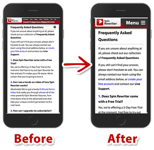 Spin Rewriter on mobile devices - Before and After
As you can see, the header of the website has been completely redesigned. We went from displaying small links to subpages that are hard to read, to having a big, friendly "Menu" button that displays all of the available subpages in an easy-to-read format.
We've also entirely redesigned the footer of the page — jump over to SpinRewriter.com website on a mobile device to check it out. 😃
Other than that, we've done a ton of work to convert all parts of the websites into a format that delivers a great experience on mobile devices. This includes larger fonts, paragraphs with more white-space, larger "targets" when it comes to clicking links and buttons, optimized images and backgrounds, etc.
Hope you like the progress, and we'll definitely keep you posted! 😃
We've just rolled out the first public beta version of our full-mobile support, and here's what the changes look like so far:
Spin Rewriter on mobile devices - Before and AfterAs you can see, the header of the website has been completely redesigned. We went from displaying small links to subpages that are hard to read, to having a big, friendly "Menu" button that displays all of the available subpages in an easy-to-read format.
We've also entirely redesigned the footer of the page — jump over to SpinRewriter.com website on a mobile device to check it out. 😃
Other than that, we've done a ton of work to convert all parts of the websites into a format that delivers a great experience on mobile devices. This includes larger fonts, paragraphs with more white-space, larger "targets" when it comes to clicking links and buttons, optimized images and backgrounds, etc.
Hope you like the progress, and we'll definitely keep you posted! 😃
Published on: September 26th, 2016
← Previous: Mobile responsiveness for Spin Rewriter