Further improved synonym selection UX
At Spin Rewriter we believe the UX (user experience) is incredibly important. That's why we're always looking for ways to improve it even further.
Today we'll be focusing on the UX changes that we've made to the synonym selection interface and that we've rolled out with a recent upate.
We realized that our existing synonym selection interface had a few potential areas for improvement — until very recently. Here they are:
- If there were too many synonyms available for a given word or phrase, sometimes the list of synonyms got cut off at the bottom of the browser window.
- Sometimes it wasn't obvious enough that the list of synonyms is scrollable.
- The input field to manually add a custom synonym was not visible enough.
And I'm beyond happy to report — we have resolved all of these UX issues:
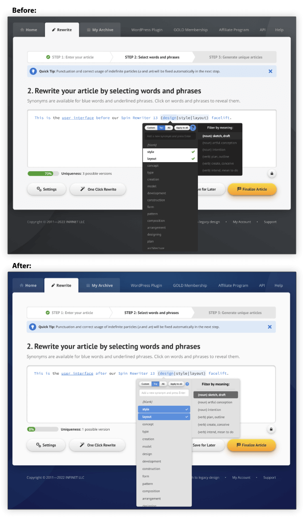
Now, with this latest update:
- The list of synonyms is never cut off abruptly at the end of the browser window. If the list is too long, it now ends in a visually pleasing way.
- When there are additional synonyms available past the end of the screen, we make sure to cut off the list at a point where users can see the top-half of the last synonym which makes it obvious that the list is scrollable.
- The input field for custom synonyms is now much more visible.
We hope you like this update. 🙌 And we'll keep working hard to make sure that Spin Rewriter remains an absolute joy to use! 🤩
For more posts, check out the Monthly Archives.
Our blog posts let our users stay up-to-date with all of the updates here at Spin Rewriter. This way you can discover all of the latest features — so you can try them out and tell us what you think.
We really appreciate all of your feedback — thank you!