Redesigned mobile menus
Here at Spin Rewriter we're never fully satisfied with the status quo. We feel there's always things to improve, and there's always a way to deliver an even better experience to our wonderful users.
Let's take a look at an example of this. 😃
The menus of the Spin Rewriter website were starting to show their age a little bit when viewed on a mobile device. While this mobile menu design might have been OK in 2019 (when it first went live), it doesn't quite cut it anymore. So we've rolled up our sleeves and rolled out a brand-new mobile menu design.
Here's what the mobile menu on the homepage of Spin Rewriter looked like before, and what it looks like now (after):
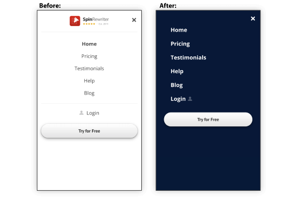
It went from offering a pretty "blah" experience to now offering a tight, consistent and friendly list of options that's also much more scannable due to its new alignment. In practice, the new menu is an absolute joy to navigate on a mobile device.
Here's what the before/after looks like for the Control Panel mobile menu:
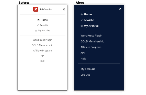
Again, the menu definitely worked fine before. It did its job. But now it's a joy to use. It's much more robust while being friendlier at the same time. Even with two new options at the end of the list, the new design makes it easier to quickly find what you're looking for.
It's little things like this that add up to something wonderful over time. At least that's how we feel. And it's hard to deny that Spin Rewriter has grown into something truly wonderful over the past 12 years! 🤩
Enjoy the new menus!
For more posts, check out the Monthly Archives.
Our blog posts let our users stay up-to-date with all of the updates here at Spin Rewriter. This way you can discover all of the latest features — so you can try them out and tell us what you think.
We really appreciate all of your feedback — thank you!